Blog Our brand-new Look and Feel
14 — 10 — 2021

In the most literal sense ‘environment’ simply means ‘surroundings’ or, in other words, all those elements surrounding us, interacting and sometimes connecting with each other and us. So, it’s correct to say that one of the basic characteristics of environment for sure is the interrelationship.
Being fully aware of this fact, we decided to deepen our relationship with the environment, not just by cautious listening and watching over our Blue Planet, but also directly and practically by widening our portfolio of environmental sensor solutions. This way we want to make sense of all important Elements and enable our users to really listen the noise, feel the wind, monitor electromagnetic radiation, to be able to check out the quality and the levels of the water, and to be aware of the air quality in their cities and communities, homes and offices, all of which would in turn, we hope, inspire the society to act.
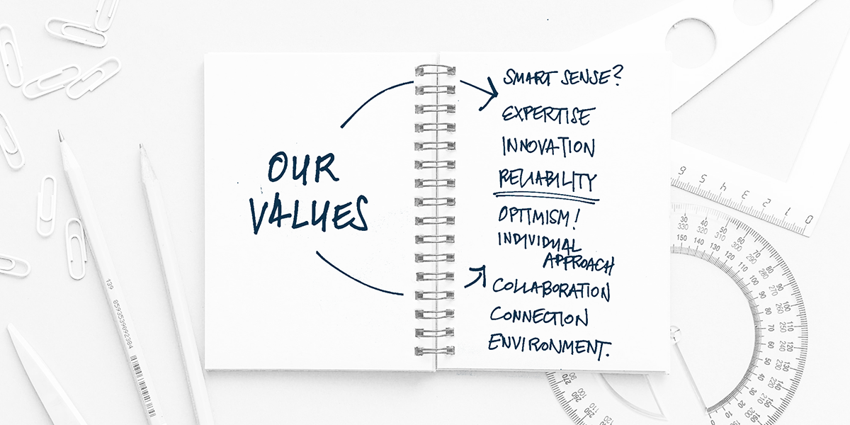
Indeed, it has inspired us to decide to undergo the peculiar introspection process of reevaluating our brand, the elements it contains and the values that are in its and our personal cores. Throughout the process we've learned and even re-learned valuable things about ourselves, and we've confirmed the correctness of our development and collaboration trajectories concerning the research, development, and production of the integrated solutions we make, whether these are technological or of user-oriented managing kind. In that context, we've strongly decided that we will continue to include and even more expand the influence of the user experience in our design process, and further develop them according to values and features such as simplicity, accessibility, and reliability.

Design philosophy, in the sense of reshaping of our appearance, and the one that we consider true to our intentions, successfully transmits the idea of openness and accessibility, modernity and simplicity, and at the same time it outlines our technologic mindset of cleanliness, yet ever revolving complexity of the empirical and scientific surroundings. Kind of like making the order, or sense for that matter, out of the elements that surround us all, and which we all try to comprehend.
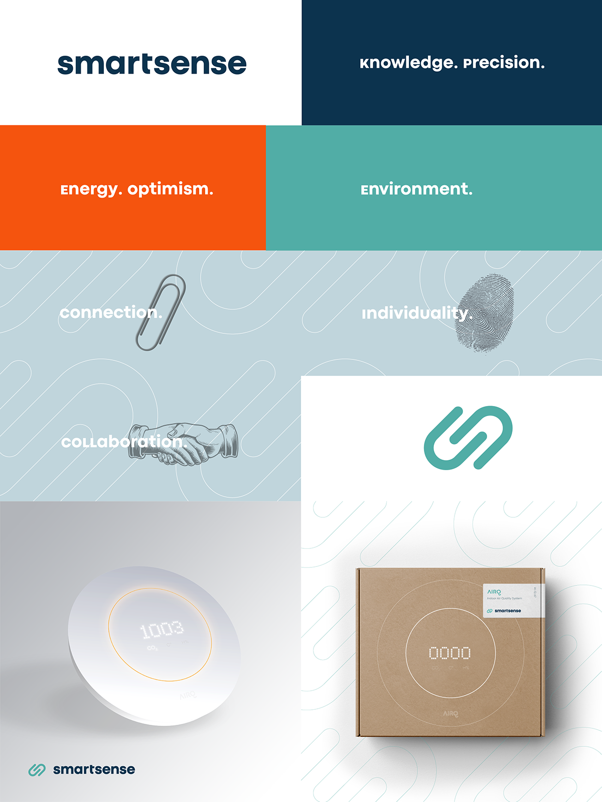
Our new brand appearance follows the exact same logic and communicates the most important, the very pinnacle of the values we care about a lot. That's why we care about our colour scheme too. Values like expertise, knowledge, integrity, and reliability are at the very core of the Smart Sense’s ethics and philosophy and they are introduced with the steadiness, coolness, and the fidelity of the colour of deep blue. Sensible life, healthier future and cleaner environment are the values guiding us and serving us all as a kind of a North Star in our everyday and work life. These are characterized by tranquil yet vibrant liveliness of the turquoise colour since these notions are the essence which connects and interweaves all our decisions and actions. Orange colour is synonymous with high energy, joy, optimism and collaboration, all attributes of the Smart Sense culture and its merry personality.

The mark in the logotype combines all those values into simple, swift, and eye-catching silhouette that incorporates several different elements at once. At first glance, it’s so easy to recognize the shape of the stylized paperclip that symbolises tight but gentle connection with the environment, surely possible to achieve by using our technology. On the other hand, the contours of this pictogram also resemble the stylized and simplified fingerprint, symbolising touch, feeling and individuality, the metaphors of established relationship with the environment.
These symbolic notions express importance of two levels of a relationship – one concerning environment and second concerning relationship with our partners. We are looking forward to work in close and interactive cooperation with our partners and to make a strong and meaningful relationships, a moment also stylishly presented with this same multi-significant graphic element, here with the symbolic meaning of an interwoven partner handshake, proudly, just like we love to end all our projects with. All these symbolic meanings incorporated into our new brand logo clearly outlook our Vision – by connecting with the Environment through an innovative and accessible technology, we want to make sense of Elements around us and create brighter and healthier future. To achieve that, we are expanding our network of partners all around the globe with goal to share our complementary knowledge and experiences.

Our brand name, Smart Sense is at the same time our proposition to the society which represents not just the fact that we can reliably sense the Elements of the Environment, but also that we can for sure make sense of them, leading us all into a smarter, safer and what we believe is a happier future.
Connect with your environment. Connect with us.
connect@smart-sense.hr
Drag